

Microsoft Excel has long been the most popular application for creating pages, charts, lists, and other things for doing business. It’s its toolkit that allows you to easily and quickly create the right chart and customize it to your needs.
Is there an option to swap between X and Y Axis in Excel
These days, almost everyone uses Microsoft Office on a daily basis. Although most people claim to be proficient in Office, this is far from the case. Excel, in particular, is not even remotely easy to use, especially if you are not tech-savvy. When you create graphs based on Excel tables, the program automatically calculates values and builds a graph based on these calculations, but there is a possibility that the automatically created graph will be uncomfortable or unattractive. To fix it, you just need to swap the axes: the X-axis should be vertical and the Y-axis should be horizontal.
Whether you’re a student, a business owner, or you love charts and graphs, you need to know how to use Excel. One of the most frequently asked questions about Excel is how to change the X-axis and the Y-axis. So, here is how to switch the X and Y-axis in Microsoft Excel.
What is a chart Axis
Charts in Excel are not that complicated if you know what to expect. There is an X-axis and a Y-axis. The first one is horizontal and the second one is vertical. When you change the horizontal X-axis, you change the categories within it. You can also change its scale for easier viewing.
The horizontal axis shows either the date or text showing different intervals of time. This axis is not numerical like the vertical axis. The vertical axis shows the value of the corresponding categories. You can use many categories, but be mindful of the size of the chart so that it will fit on the Excel page. The best number of data sets for a visual Excel chart is four to six. If you have more data to display, perhaps divide it into multiple charts, which is not difficult to do.
How to switch X and Y-axis in Microsoft Excel
If you want to switch the X and Y-axis in Microsoft Excel, you have to follow these steps:
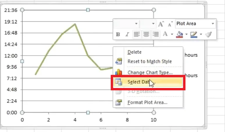
- First of all, right-click on one of the axes and select “Select Data”. This way you can also change the data source for the chart.
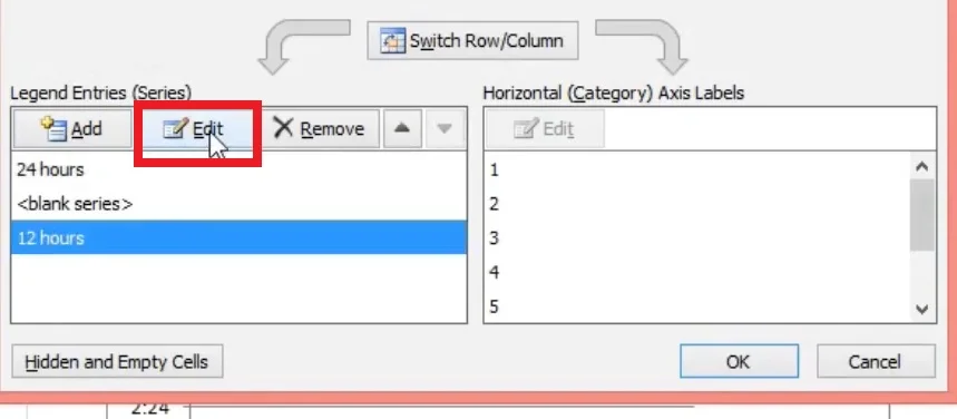
- In the “Select Data Source” dialog box, you can see the vertical values, which are the X-axis. Also on the right are the horizontal values, which are the Y-axis. To switch axes, you must click on the “Edit” button on the left.
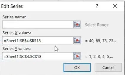
- The popup shows that the X series values are in the range “=Sheet1!$B$2:$B$10” and the Y series values are in the range “=Sheet1!$C$2:$C$10”.
- To change the values, you need to swap the two ranges so that the range for the X series becomes the range for the Y series and vice versa. So, in the X series values, enter “=Sheet1!$C$2:$C$10” and in the Y series values, enter “=Sheet1!$B$2:$B$10”.
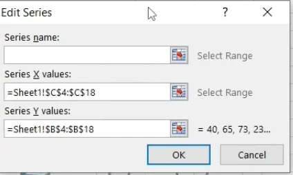
- Then, confirm changes, you will be redirected back to the “Select Data Source” window, and click “OK”.
Once you have completed these steps, the X and T-axis will be switched.
How to change the Y Axis scale in Excel
In case you need to decrease the range down a little to focus on a particular range or reverse the order of the axis, here’s a guide:
- In your chart, click the “Y axis” that you want to change. It will show a border to represent that it is highlighted/selected.
- Click on the “Format” tab, then choose “Format Selection.”
- The “Format Axis” dialog box appears.
- To change the beginning and ending or minimum and maximum values, go to the “Axis Options -> Bounds” section, then type a new number in the “Minimum” and “Maximum” boxes. If you need to revert the change, click on “Reset.”
- To change the interval/spacing of tick marks or grid lines, go to the “Axis Options -> Units” section, then type a new number in the “Major unit” or “Minor unit” option depending on your needs. If you need to revert the change, click on “Reset.”
- To change the crosspoint of the X and Y axis, go to the “Axis Options -> Vertical axis crosses” option, then choose “Automatic,” “Axis value,” or “Maximum axis value.” If choosing “Axis value,” type the value you want to become the crosspoint.
- To change the displayed units, such as changing 1,000,000 to 1 where units represent millions, go to the “Axis Options -> Display units” section. Click the dropdown next to “Display Units,” then make your selection such as “millions” or “hundreds.”
- To label the displayed units, go to the “Axis Options -> Display units” section. Add a checkmark in the “Show display units label on chart” box, then type your “unit label” such as “Numbers based in millions.”
- To switch the value axis to a logarithmic scale, go to the “Axis Options -> Display units” section, then add a checkmark in the “Logarithmic scale” box.
- To reverse the order of the vertical values, go to the “Axis Options -> Display units” section, then add a checkmark in the “Values in reverse order” box. This action also reverses the horizontal axis to reflect accuracy in your chart or graph.
- To adjust the placement of tick marks, go to the “Tick Marks” section. Click the dropdowns next to “Major Type” and “Minor type,” then make your selection.
- To change the axis label’s position, go to the “Labels” section. Click the dropdown next to “Label Position,” then make your selection.
Now you know more on how to manage your Excel properties and make the job easier.


