

Monitor calibration is adjusting and aligning your display’s color and brightness settings to ensure the most accurate color reproduction possible. It involves adjusting your monitor’s color settings to industry standards to make the colors you see on your screen realistic.
The calibration process usually involves displaying color samples on the screen and adjusting the monitor settings until the samples match the reference image. This ensures that the colors on your monitor match the standards, allowing you to see accurate colors on different devices and platforms.
In this article, I will first describe the steps for calibrating your monitor. Then in the next section, I will explain the recommendations for each item to calibrate. I’ll also break down the default color profiles on the Mac.
How does color calibrate your Mac’s display?
Color calibration is an important process to ensure that the colors on your Mac display are accurate. Below I will describe the steps to follow. In the next section, I will also write recommendations and requirements for each section. So to color calibrate your Mac’s display, you need to follow these steps:
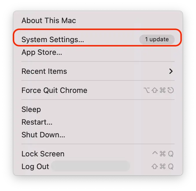
- Click on the Apple icon in the upper left corner of the screen and select “System Settings“.
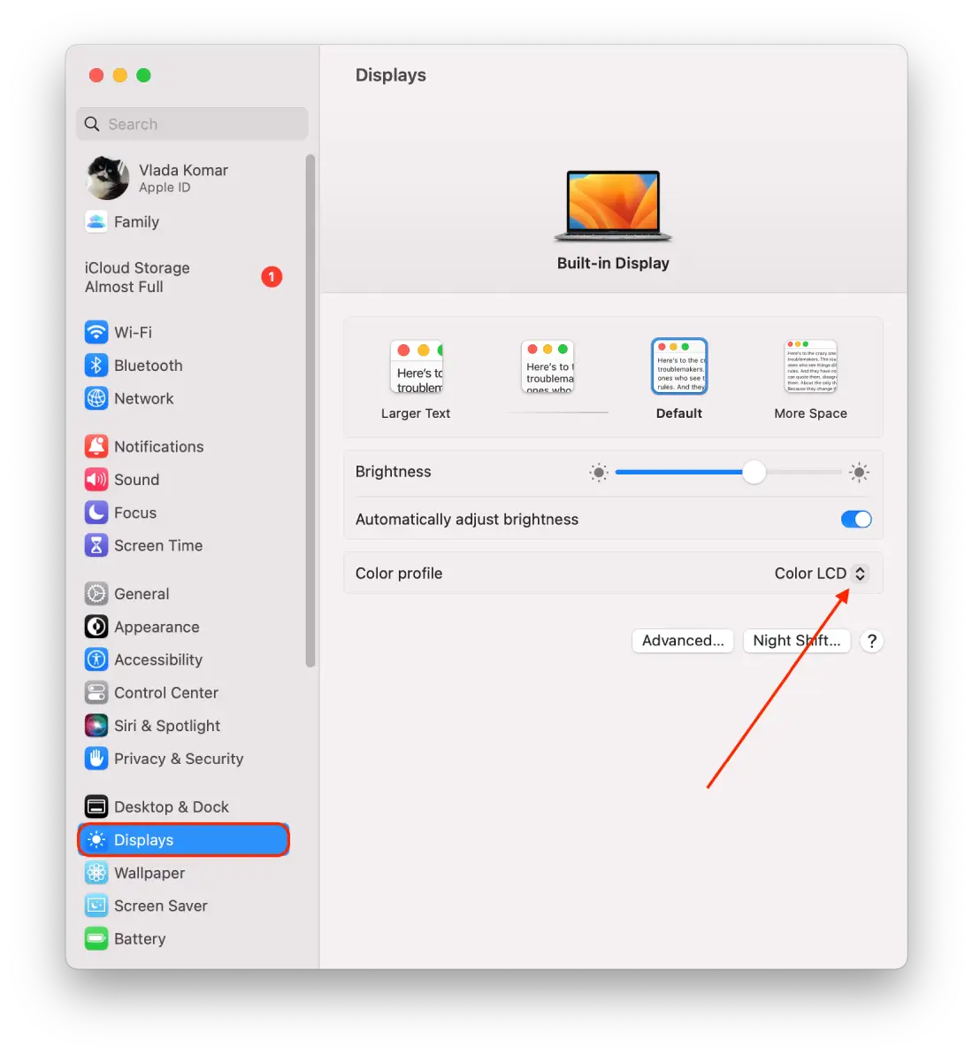
- Then open the “Displays” section on the left side of the screen.
- Click on “Color profile“.
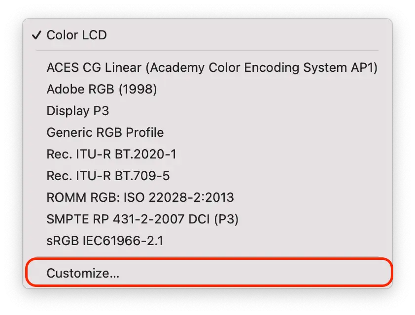
- From the drop-down list select the “Customize” option.
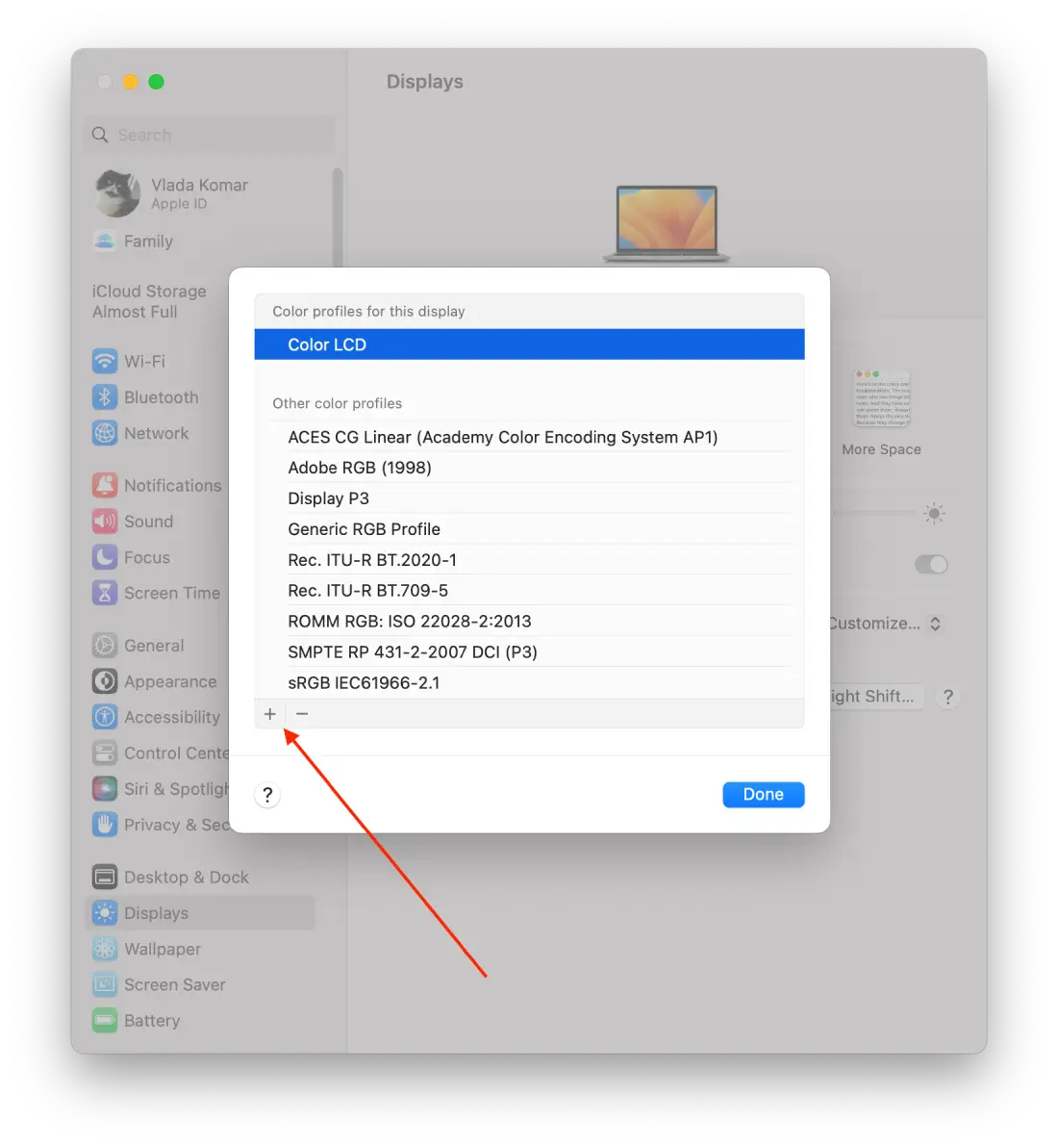
- Next, hold down the “Option” button and click on the “+” icon. If you hold down “Option” and click “+” at the same time you will see more options for customizing your display.
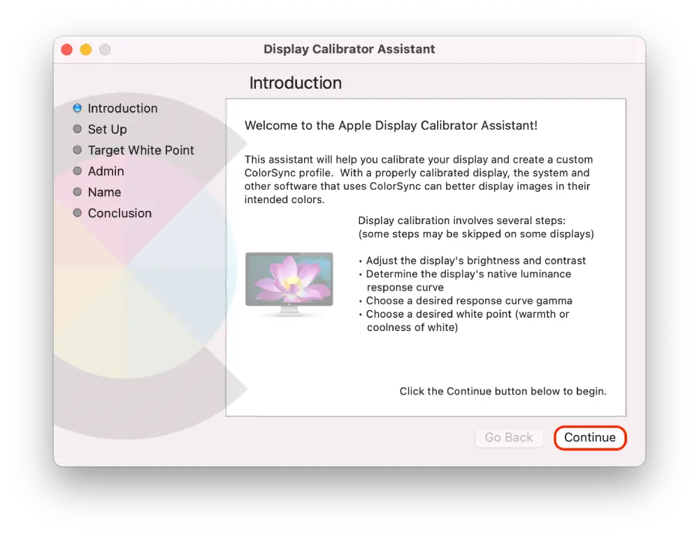
- Then in a new window, read the introduction and click on “Continue.”
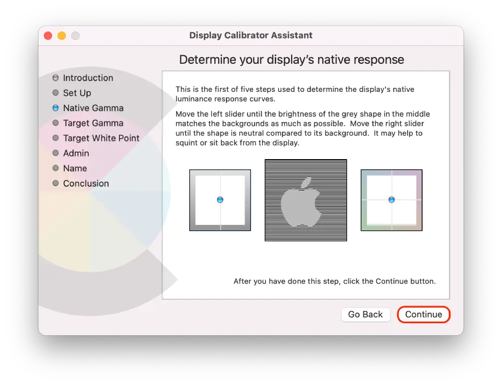
- Adjust the left slider until the brightness of the Apple logo matches the background. Then adjust the right slider until the shape of the Apple logo is neutral compared to the background. And click “Continue.”
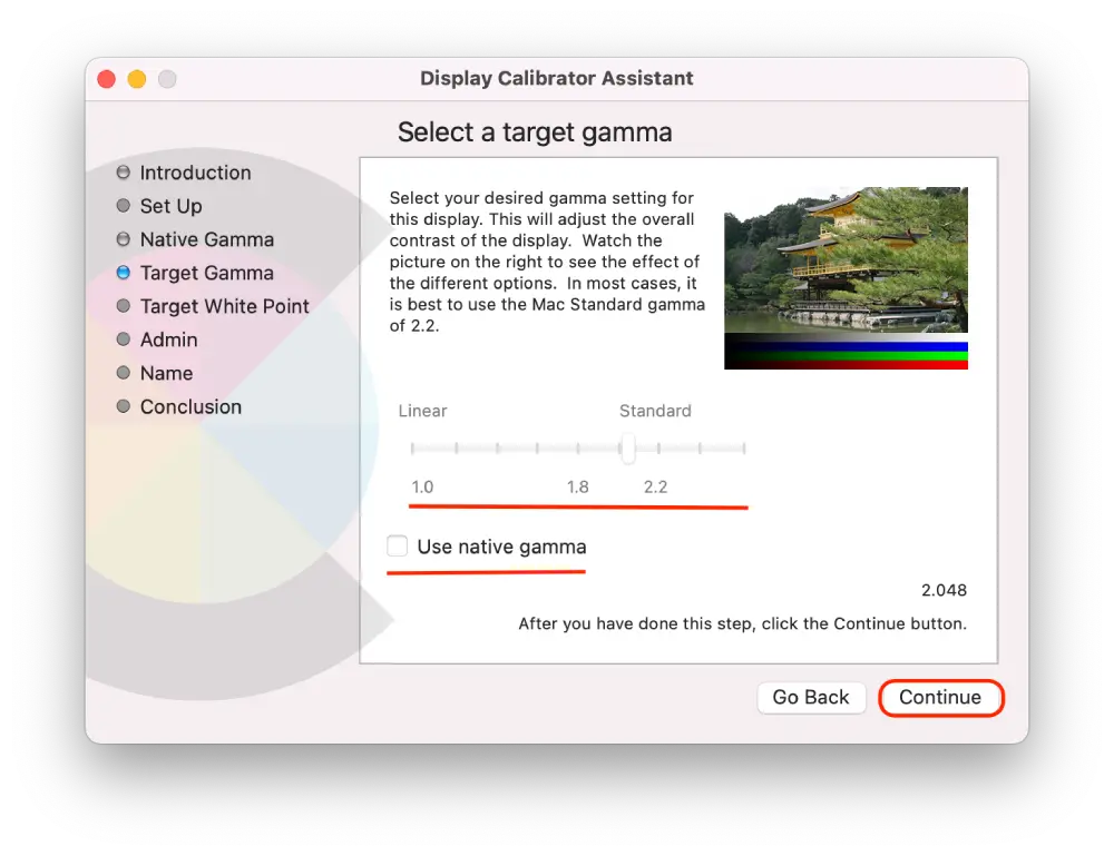
- Then move the slider until you reach the desired contrast and click “Continue.” (You can also check the “use native gamma” checkbox).
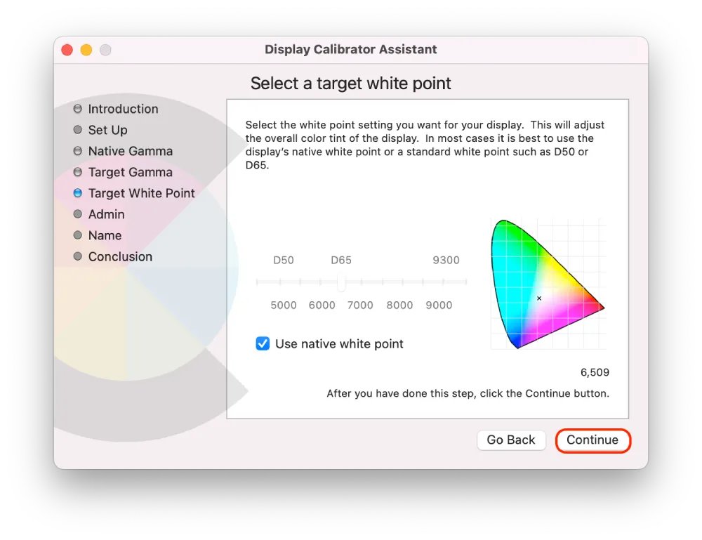
- Now adjust the overall color shade of your display using the slider.
- If you want to allow other users to see the calibrated display, check the box.
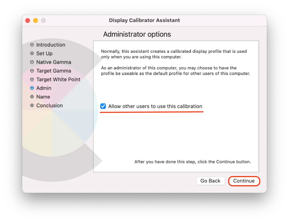
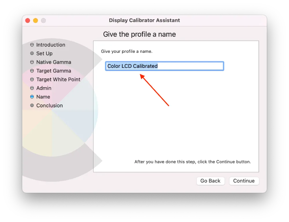
- Then give your profile a name and click “Continue.“
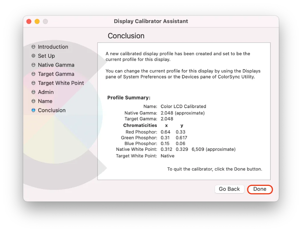
- A new window will show all your settings. Click on “Done” to finish it.
If this is your first time doing this, don’t worry, as each new window has brief guidelines for doing so.
And after these steps, you’ll now get a more accurate representation of colors, making it easier to edit photos, videos, and other visual materials.
How do to properly calibrate each option?
When you open the Display Calibrator Assistant, you will see three options to configure to suit your needs. Below I will describe some recommendations for each option when calibrating your display to the source gamma, target gamma, and white point:
Native Gamma
- For a Mac display, the recommended Native Gamma setting is usually 2.2. This setting is the default for most displays, but it’s important to double-check your specific model to make sure.
- Adjust the gamma until you can see all the shades in a grayscale image. You should be able to distinguish between the darkest and lightest shades without any blending or loss of detail.
- If you’re working in a dimly lit room, you may need to adjust the gamma slightly to compensate for the low-lighting conditions.
- Be careful not to make the display too bright or dark, as this can cause eye strain and affect your ability to see details.
- For this setting, squinting or moving at least three feet away from the display is helpful.
Target Gamma
- Choose a target gamma value that suits your use case. For example, if you are working with photos, you might choose a gamma value of 2.2. If you are working with video, it is better to choose a gamma value of 2.4.
- The target gamma value is a personal preference, so you may need to experiment with different values to find the one that works best for you.
Target White Point
- White Point allows you to adjust the display’s color temperature according to the workplace’s lighting conditions.
- The White Point setting is usually measured in degrees Kelvin (K), with lower values indicating warmer colors and higher values indicating cooler colors.
- The most common white point values are 6500K (D65), considered neutral white, and 5000K (D50), considered warm white.
- When calibrating your display, choose a white point value that matches the lighting conditions of your workspace.
- Neutral gray should appear as neutral, with no visible color cast.
- Be careful not to make the white point too warm or too cool, affecting color accuracy.
Should you use the default color profiles on a Mac?
Whether you should use the default color profiles on your Mac depends on your specific use case and needs. In my case, for example, it’s not a necessity. But about six months ago, when I opened the display settings out of interest, I found it much more pleasant to work on my Mac.
For most users, the default color profiles on a Mac will be sufficient for everyday use, such as viewing web pages, watching videos, or editing documents. Default profiles, such as sRGB or Display P3, are designed to provide accurate and consistent colors across devices and platforms.
However, if you are a professional photographer, videographer, or graphic designer, you may need to use more specialized color profiles.
What built-in color profiles on the Mac might work for photographers or videographers?
For photographers and videographers, the Mac has several built-in color profiles that can fit your specific needs.
Adobe RGB (1998)
This color profile is designed for professional printing and graphic design workflows. It provides a wider range of colors than sRGB and is often used in high-end monitors and printers. If you’re working with professional photo or video editing software, such as Adobe Photoshop or Lightroom, this profile may be a good choice.
DCI-P3
This color profile is designed specifically for use in digital cinema workflows. It provides a wider range of colors than sRGB and is often used in professional video editing software, such as Final Cut Pro.
Display P3
This is a newer color profile that is used for newer Mac displays, such as those on the MacBook Pro and iMac Pro. It provides a larger range of colors than sRGB, which can be useful for professional photo and video editing.
But in my opinion, they are not perfect. I tested each of them and came to the conclusion that it is best to create your own profile to be more comfortable to work with. If you don’t want to deal with it, they’re not bad.


