

I think many would agree that Apple’s graphic designers are cool guys. Looking back at the ’97 design might give you a chuckle, but it was all the rage back then. So, let’s cut them some slack. Even in ’98, the homepage had evolved into something quite impressive for its time—a significant leap forward within just a year.
The 2000s saw the homepage getting cleaner and sharper, with big, beautiful product shots front and center. Remember the “I’m a Mac, I’m a PC” ads? Total game-changer, adding a fun twist to Apple’s vibe.
The 2010s kicked it up a notch with even slicker designs, high-quality images, and smooth animations that made everything look sharp and inviting.
Starting in 2013, Apple began adding video icons next to their products. But a couple of years later, they switched up the video buttons for simple “Watch” and “Learn more” links, making everything look clean and modern.
From 2017 to 2023, not much changed—it all stayed stylish. There were no more empty fields. We kinda got used to the good stuff.
Right now, in early 2024, Apple’s big sell is the Vision Pro. They’ve wiped other products from the homepage, clearly, just for now (you can still find the rest through the navigation, of course). Can’t say I remember them ever doing this before. Usually, the latest release just lands at the top. But then, they’ve never had something like the Vision Pro on the market.
1996-1997
If you had visited Apple.com back in 1996 or 1997, you’d find looking at what much resembled an informational newsletter:
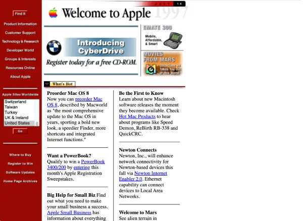
This setup would strike a chord for those who recall the web vibes of the mid to late ’90s. Vertical navigation stacks were the norm back then. During 96-’97, the homepage featured three distinct GIF images that swapped out as new Macintosh computers rolled out, including the likes of Performa, Power Macintosh, and PowerBook series.
Below this, a two-column layout stretched down the page, filled with bits like “Pre-order Mac OS 8,” “Want a PowerBook?”, “Big Help for Small Biz,” “Boston’s Mac Party,” and “Schools Go Mac.”
This layout design had a short lifespan, sticking around for just about two years.
1998-1999
In 1998, Apple took a sharp turn with its website design, ditching the old red-and-white newsletter vibe for a clean, white backdrop spotlighting its products.
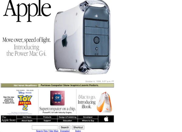
The left-side navigation was gone, with content now centered and streamlined. Product visuals were clear and focused, with the Power Mac G4 taking the spotlight.
The homepage hero changed every month or so. For instance, in October ’99, it was an orange iMac G3, followed by a blue one in November.
Smaller blocks drew attention to other products or features, showcasing the Mac’s capabilities and what you could achieve with them.
And, btw, ’99 was the year Apple switched its logo to a sleek white.
2000
This year saw Apple introducing a special navigation bar at the top of its site:
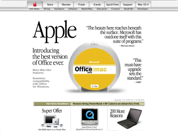
Many past design elements remained, with “Hot News” still making its rounds.
But the top of the page now boasted a new navigation bar featuring Store, iReviews, iTools, iCards, QuickTime, Support, and Mac OS. The introduction of this tab-like navigation bar, mimicking physical folder tabs, was noteworthy as it influenced many other websites in the early 2000s.
Did you notice the Apple icon turned red? I have to say, the early 2000s design vibe was cool.
2001-2002
In 2001, the company dropped the bulky “Apple” text and switched the red Apple logo to blue.
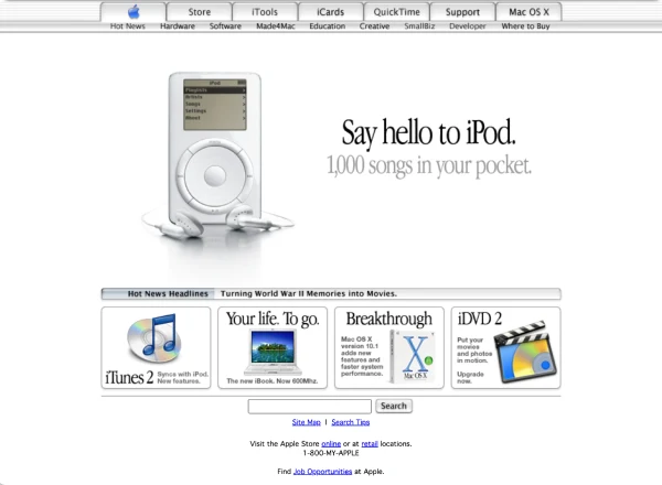
Early in 2001, the new iMac with iTunes and a CD-RW drive took center stage, followed by promotions for the new iBook. By fall, the first iPod made its debut and stuck around. Then in 2002, the spotlight was on the new iMac G4. The iMac G4, initially known as “The new iMac,” boasted an adjustable LCD display (15, 17, and 20 inches) mounted on an arm connected to a half-sphere base. This became Apple’s showcase until year’s end.
The ticker (hot news) turned gray, and the iReviews button was also removed from the top.
2003
In 2003, Apple rolled out the iTunes Music Store, a game-changing music sales service that synced up with the iPod. This became the centerpiece of their website. Then, come summer, they refreshed their design and spotlighted the Power Mac G5.
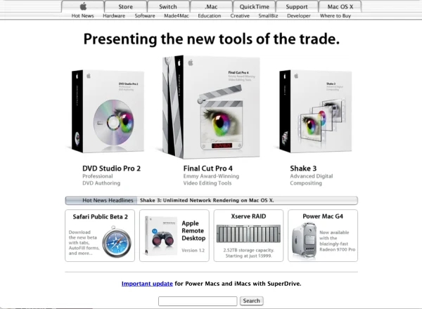
Overall, 2003 didn’t bring any earth-shattering changes to Apple’s site besides spotlighting their latest gear on the homepage.
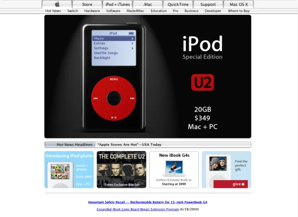
2004-2006
The 2004 design vibe stayed pretty consistent, with iTunes ads getting a refresh almost monthly. Then the new iPod U2 edition dropped. This was when Apple first dished out ads that felt more familiar to us today—product glam shots against a dark backdrop.
Following suit, they showcased the new Power Mac G5 similarly. And in December 2004, they switched gears, replacing product promos with a heartfelt message: “Our hearts reach out to those hurt by the Indian Ocean tsunamis,” featuring links to aid organizations for the victims and their families.
In 2006, the “Hot News Headlines” had vanished from the homepage, bowing out completely. It seemed folks no longer needed media headlines to be convinced of Apple’s cool factor.
I also want to shout out the iconic 2006 Apple ad campaign “I’m a Mac, I’m a PC”:
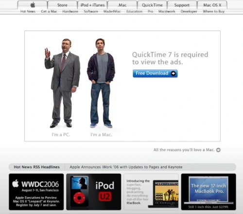
A lot of folks remember Apple’s legendary “Mac vs. PC” ads, in which two dudes—actually, personifications of the products they were hyping—had a polite back-and-forth about the ups and downs of Apple’s Mac systems versus Microsoft Windows PCs.
In these ads, Justin Long as the “Mac” always came out on top in his debates against “PC,” played by John Hodgman.
The cool part was how they always managed to spotlight a bunch of Apple’s product features, from Mac’s hardware perks to slick software tricks for the iPhone.
This ad series exploded, with 66 episodes helping Apple highlight its innovative products and features. If you’re curious, you can still catch many of them on YouTube.
This series also cemented Long’s rep as the “I’m a Mac” guy, and his chill, confident “Mac” persona became one of the most memorable marketing vibes of the 2000s.
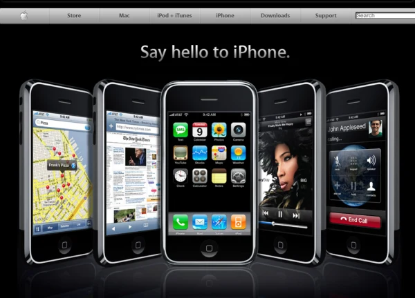
2007
2007 was a banner year with the iPhone’s debut at the Worldwide Developers Conference (WWDC), where Apple opted for a sleek, dark background for the big reveal. Pretty slick, right?
After that, Apple released Mac OS X Leopard in a similar style. The website’s navigation turned gray, and they started using a design trick called skeuomorphism. Basically, skeuomorphism is when digital stuff is made to look like real-life things.
Apple pitched it as a way to introduce the new through the old. And if you’ve noticed, Apple still rocks this trick today.
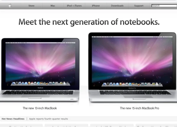
2008-2009
The vibe was all about simplicity and clarity. At the start of ’08, Apple’s homepage spotlighted the iPhone Software Roadmap and then introduced the new iMac. In the summer, the iPhone 3G took over the homepage with a simpler aesthetic compared to 2007, just showcasing iPhones against a light backdrop.
In 2009, Apple added a new twist with video presentations for all products. A “Watch video” button appeared next to product photos, which was quite a fresh feature. This approach was used to unveil the MacBook Pro, MacBook Air, iPhone 3GS, and iMac throughout 2009.
By the way, Hot News Headlines is back. It was as unremarkable and gray as before, and at the same time, news reviews like CNET and others disappeared.
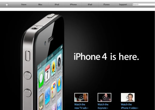
2010
This year, Apple stuck with the video presentation button for their products. Spring brought in the iPad, summer was all about the iPhone 4, and fall featured the iPod. The iPad launch in April was a big deal, adding a whole new product category to the homepage.
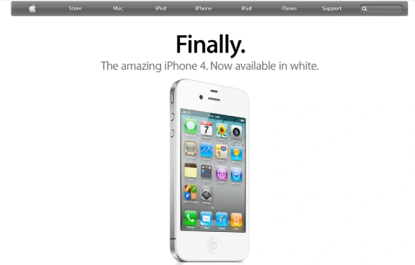
2011
In 2011, Apple went for a darker look with their navigation bar and simplified the search bar, which spruced things up. They introduced the white iPhone 4 with just a simple “Finally” on the homepage. They also added flags at the bottom for choosing your region, giving the site a small but fresh update.
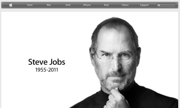
But everything changed in October when Steve Jobs passed away. Apple paid tribute and featured his photo on the homepage with his birth and death years, linking to a memorial site filled with messages from people inspired by him.
2012
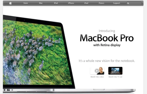
The design hasn’t changed much this year, but I did enjoy my June introduction to the new MacBook Pro with Retina display. The design was pretty stylish for the time, and pretty much everything else was in the same style.
2013-2014
In 2013, Apple’s homepage got a sick makeover! They revamped the navigation design, turning it into a sleek gray. The whole vibe was minimalist, and the product shots? Super crisp.
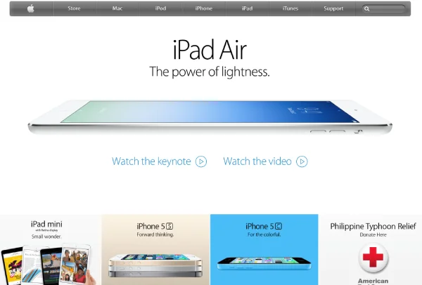
They ditched the old-school video presentation buttons, swapping them out for cool blue “Watch the keynote” and “Learn more” links. Overall, the design was about keeping colors minimal and looking sharp.
2014-2016
The design during these years? Absolute fire.
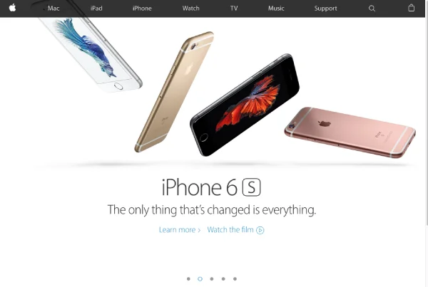
The navigation got an upgrade to this black, semi-transparent look. Product images were now full-screen, no more boxed-in photos. You could scroll through all the hot products at the time: the 12-inch MacBook, iPhone 6s and 6s Plus, iPad Pro, Apple Watch. No harsh edges, and it looked wicked cool. They’re still rocking this style today.
By 2016, they kept rolling with this look and added arrows so you could peep at all the new drops: iPhone SE, iPhone 7 and 7 Plus, MacBook Pro with Touch Bar, and Apple Watch Series 2.
They kept it chill at the bottom with little square icons for different products, news, and all the essentials.
2017-2019
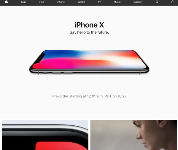
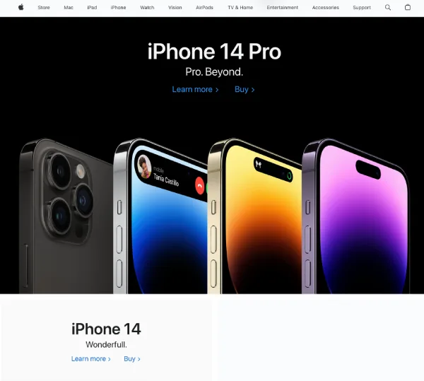
Starting in 2017, the design took a major leap. No more free space; it was all about the new releases with catchy slogans. Subtle text for pre-orders or pricing followed, and then the real eye candy. The bottom part of the page had this strip of big square frames showing off cool features, like the iPhone X’s camera corners, the inside tech of the camera, and switching portrait modes. That year, they showcased the iPhone 8 and 8 Plus, iPhone X, 10.5-inch iPad Pro, and Apple Watch Series 3.
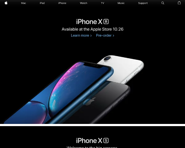
2018 had a similar vibe, but the top product shot was set against a black background. The iPhone XR was showcased like this, with the XS right below. Then came the Apple Watch Series 4 ad, followed by loads of big blocks for AirPods, Apple Music, MacBook Pro, and iPad.
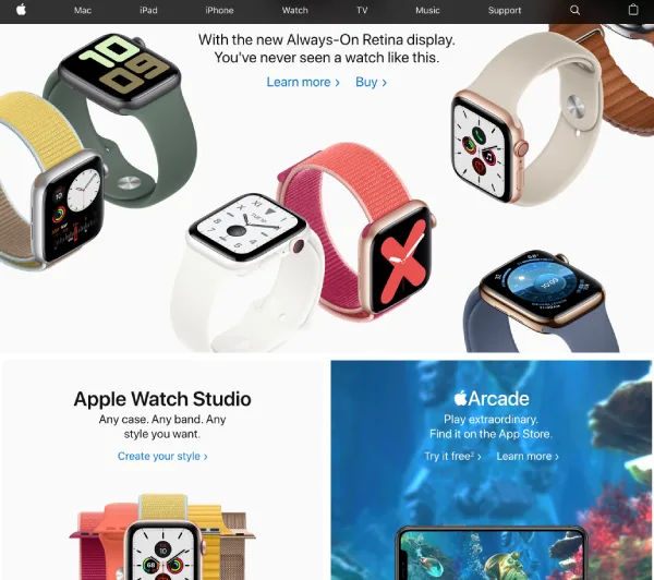
2019 was all about repeating that formula but with even slicker and higher-quality photos. The iPhone 11 Pro was introduced with water splashes, followed by all the iPhone 11 colors, then the Apple Watch Series 5, Arcade, and Apple TV.
So, these three years had a similar theme, with the main difference being the products.
2020-2021
Apple kept on with the borderless design for the homepage, but in 2020, they turned up the cool factor. Each page section got bigger, with catchy slogans or purchase info added. And the images? Even more engaging. As usual, the design was refreshed every couple of months.
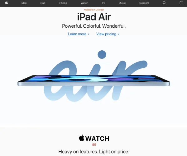
Throughout 2020, the homepage introduced the iPhone SE (2nd gen), iPhone 12 and 12 Mini, iPhone 12 Pro and Pro Max, 4th gen iPad Air, MacBook Air, MacBook Pro, and Mac Mini with the M1 chip, along with the Apple Watch Series 6 and SE.
In 2021, the design vibe stayed consistent, and we saw the iPhone 13, iPad Pro with M1, 24-inch iMac with M1, 14 and 16-inch MacBook Pro with M1 Pro and M1 Max chips, and the Apple Watch Series 7.
2022-2023
So, in ’22, Apple just kept rolling with its vibe, sticking to the same slick design. Up top, you’d find the latest iPhone, frameless, followed by slightly smaller icons for other gadgets. It was all modern and cool, and it made finding what you needed a breeze.
It’s exactly the same in 2023. Maybe a little more colorful site, but still just as cool. Scroll down, and you’ll catch some neat animations that got a bit of a tweak over these two years.
During this time, they dropped some hot releases like the iPhone 14, 15, MacBook Air M2, iPad Air M1, 9th gen iPad, iPad Pro M2, MacBook Pro with M2 Pro and M2 Max, and the Apple Watch Series 8, 9, and Ultra.
2024
Now, this is where things got a bit spicy. In January 2024, the homepage was all about the Vision Pro. We see this video of a chick wearing the Vision Pro—not just a static photo like the old days. She opens her eyes and shifts her expression a bit. And there are only two buttons: “Learn more” and “Buy.”
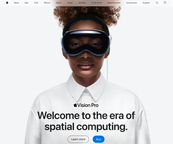
Oh, and the top nav got a makeover, turning white and semi-transparent. But who knows, they might flip it back to its classic dark style since the Vision Pro is set against a white backdrop, and the nav might mess with the overall look. We’ll see what changes they bring next. And yup, they added a new “Vision” section to the nav.
And if you want to see how other sites have changed, you can use Internet Archive like I did. Just enter the desired site in the search box and select the date.


